DHFA
Industry
Sports
Services
Branding | Illustration | Copywriting
This was a rebranding project for Denver Historical Fencing Academy. This company approached me about helping to bring their brand into the present. Their past branding was very similar to other historical weapon brands, and they wanted to stand out and make an impact on the younger generation. The final deliverables included: strategy and company analysis/research, logo and co-logo design, copywriting, and image treatments.
DHFA
Logo
In the new logo, you can see a nod to the original logo, but there is also a refreshing geometric take on the design. Since I kept several key elements of the first logo, DHFA's clients will be able to recognize the new elements while also registering it as Denver Historical Fencing Academy.
While tying together these crucial components, I contained it in a grid system that is easy to replicate and also mimics the photo treatments. This results in a clean and modern design that can be consistent across all platforms.

DHFA
Co-logo
The chosen shape of the badge is reminiscent of the type effects on the images. This will appear on either apparel or merchandise. These can also be used as watermarks on posted images.
While tying together these crucial components, I contained it in a grid system that is easy to replicate and also mimics the photo treatments. This results in a clean and modern design that can be consistent across all platforms.
Graphic Tool Kit
These weapon-inspired graphic elements will be repeated across several different visual platforms for overall consistency of look and feel.
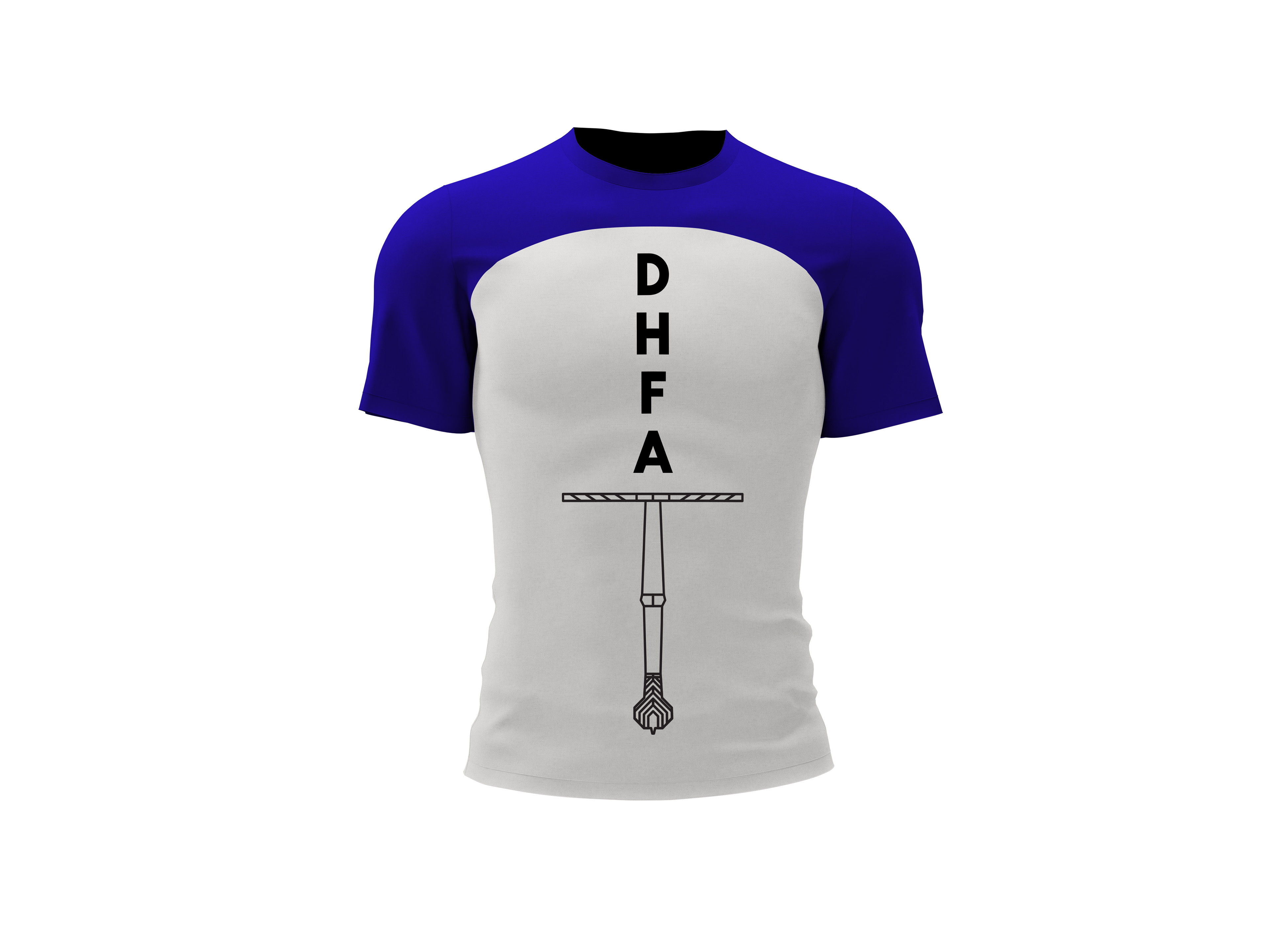

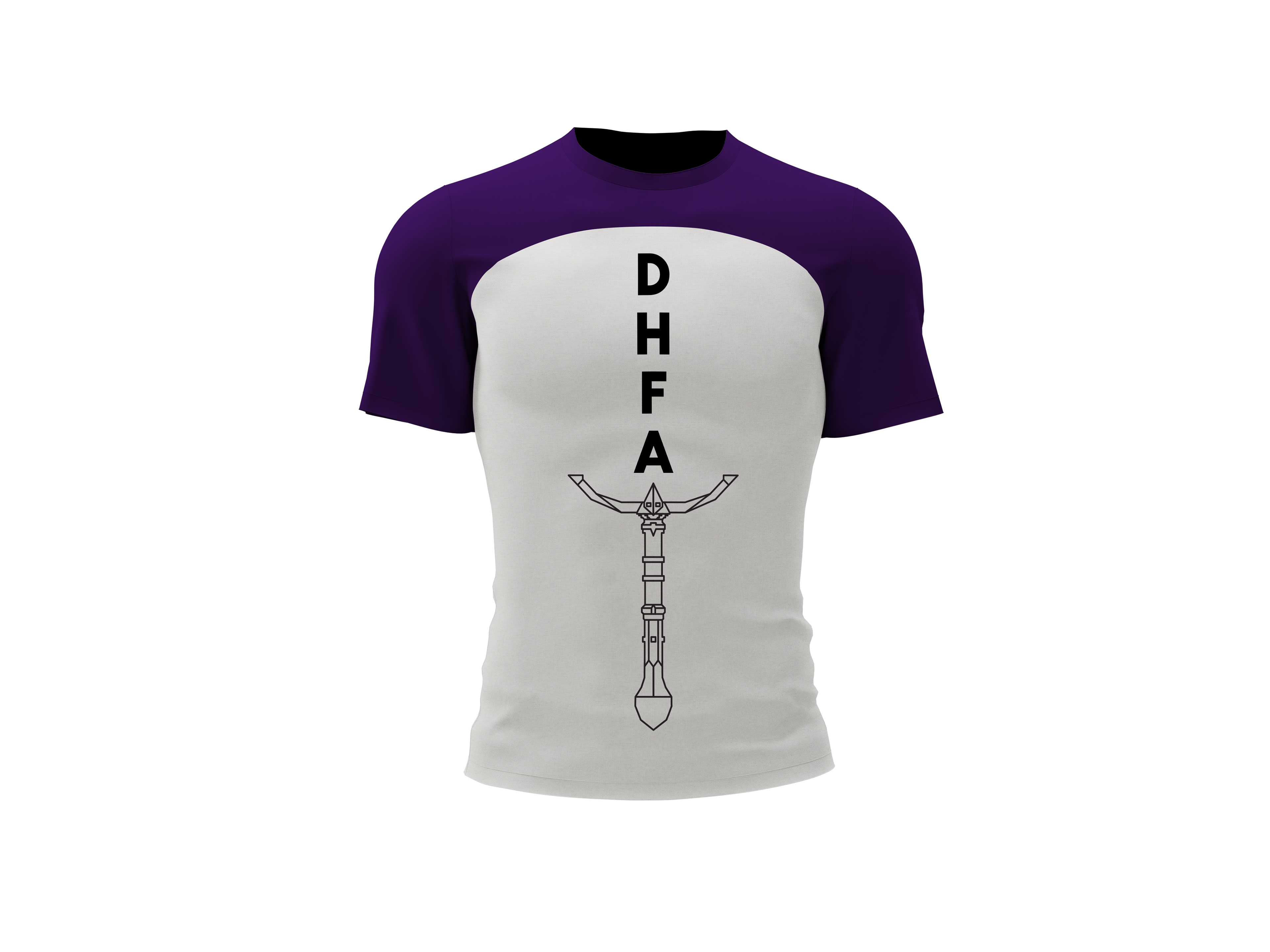
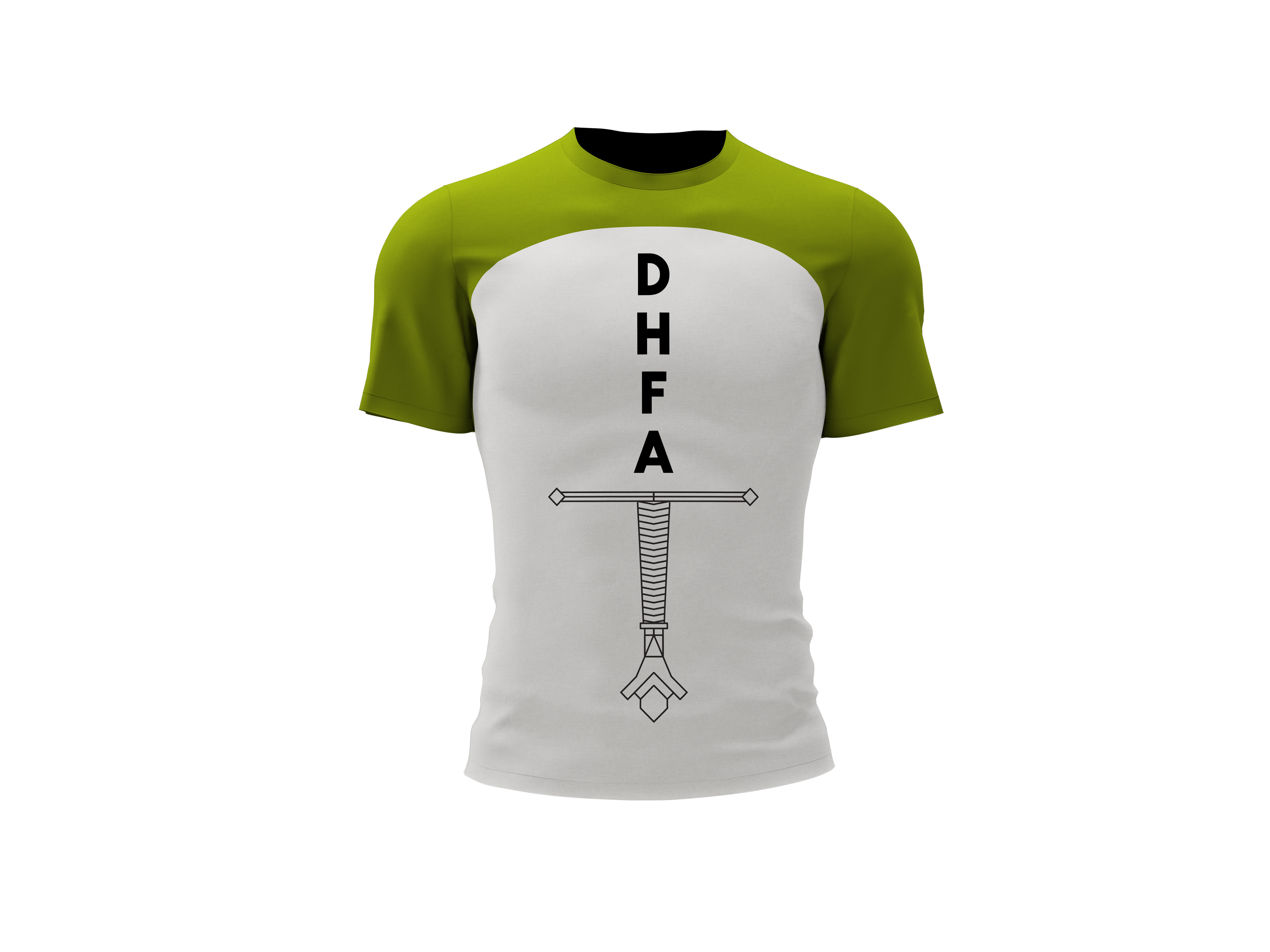
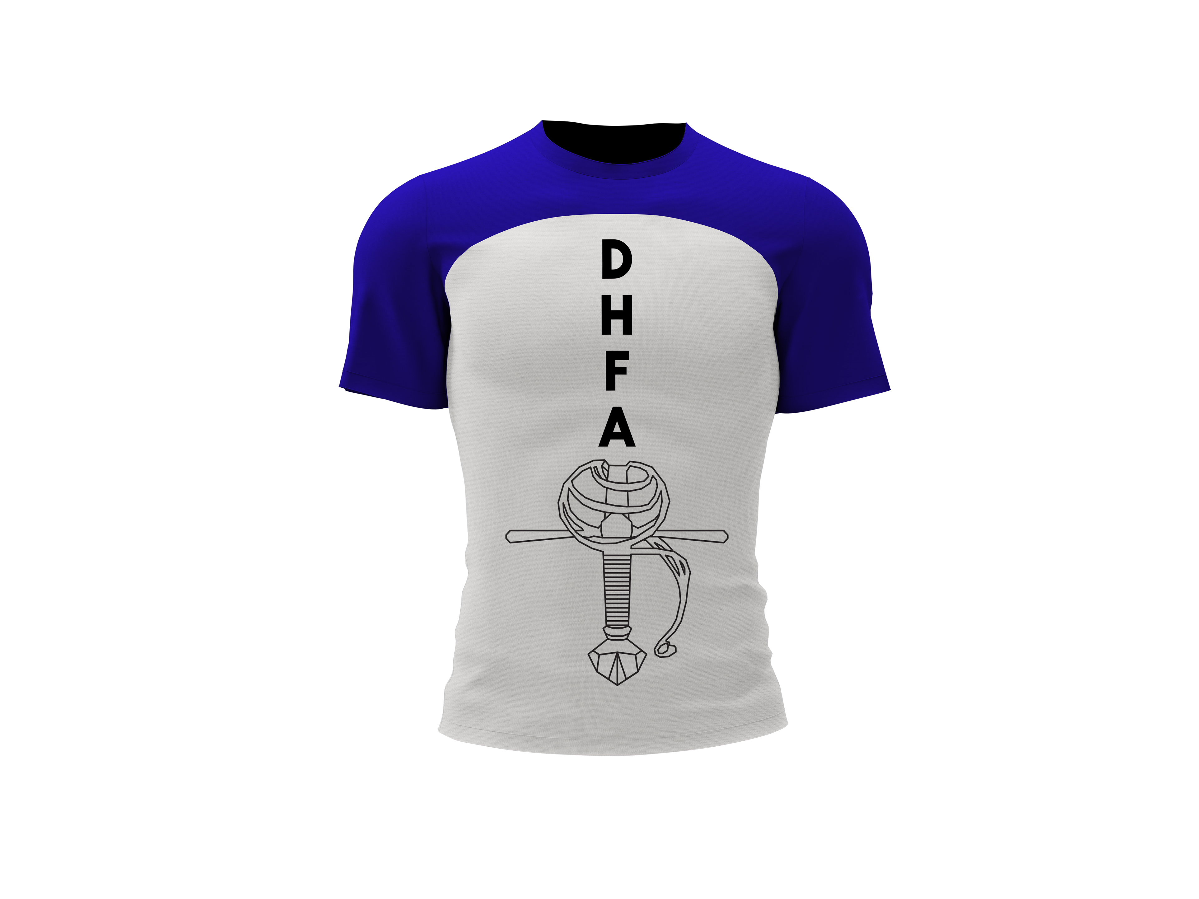
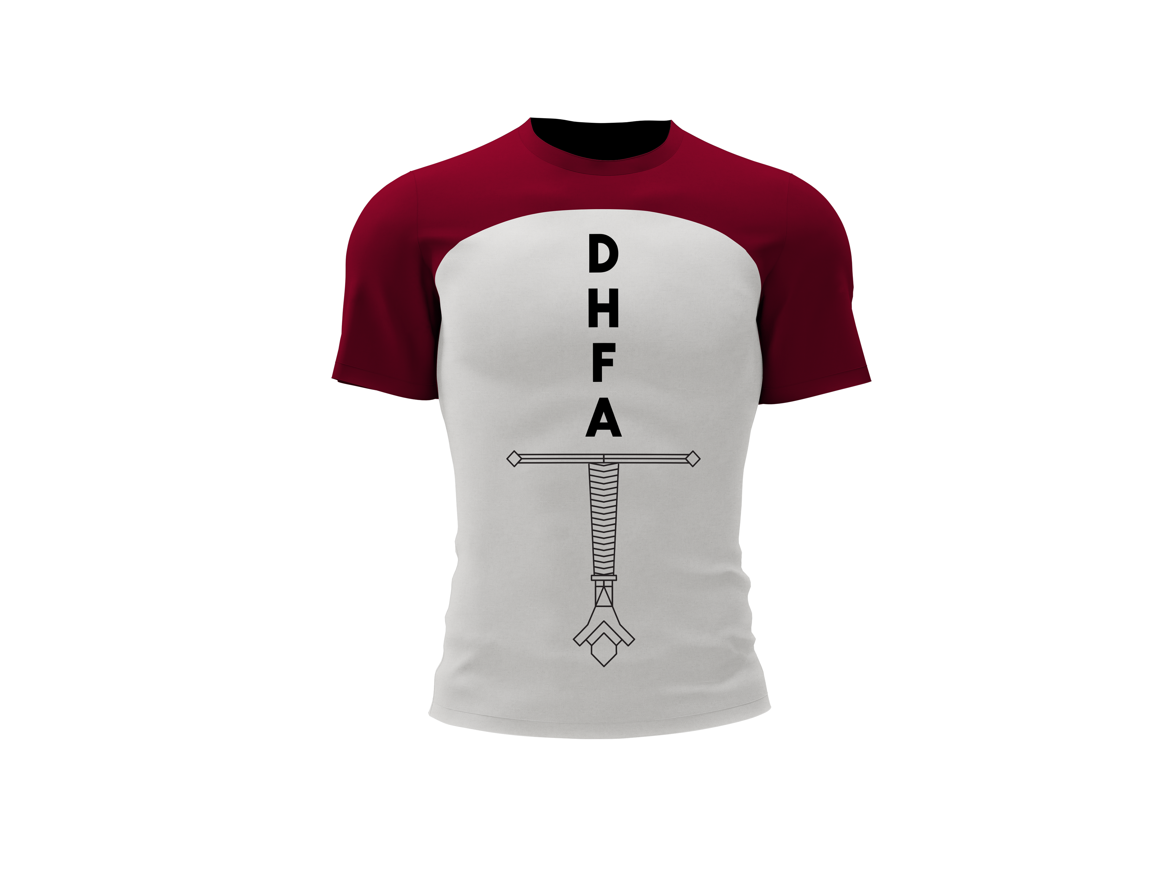
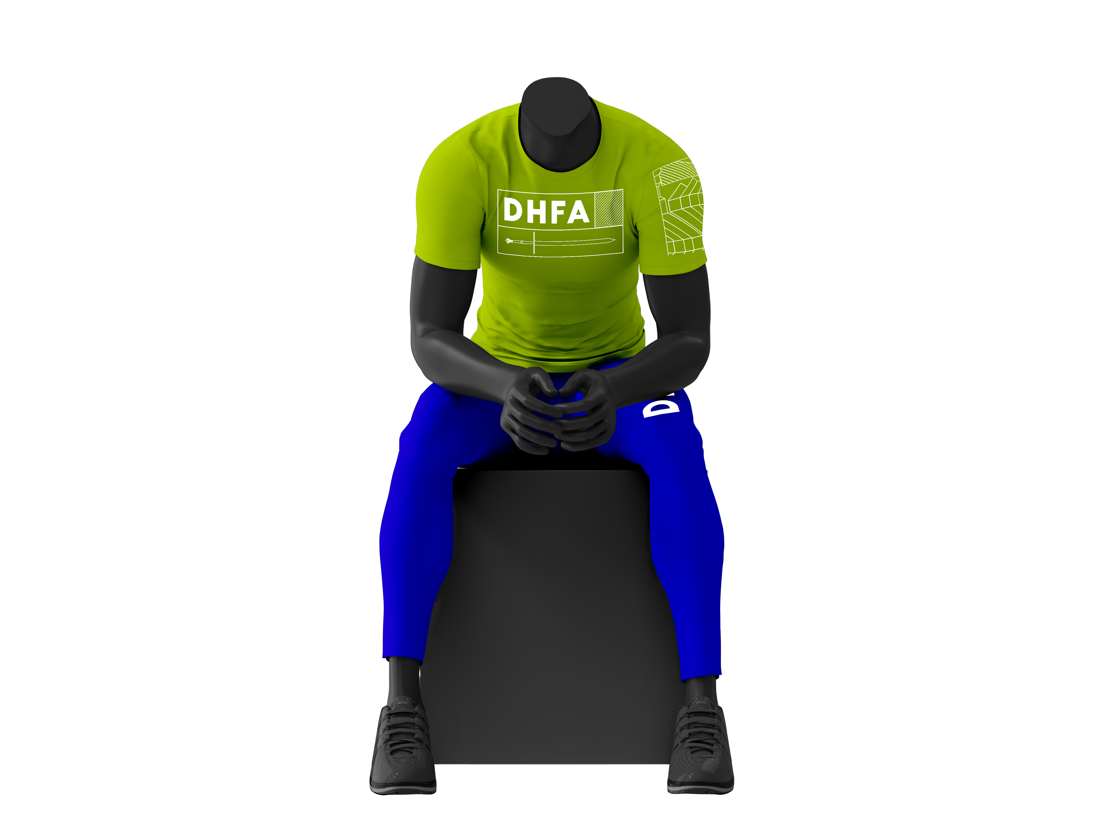
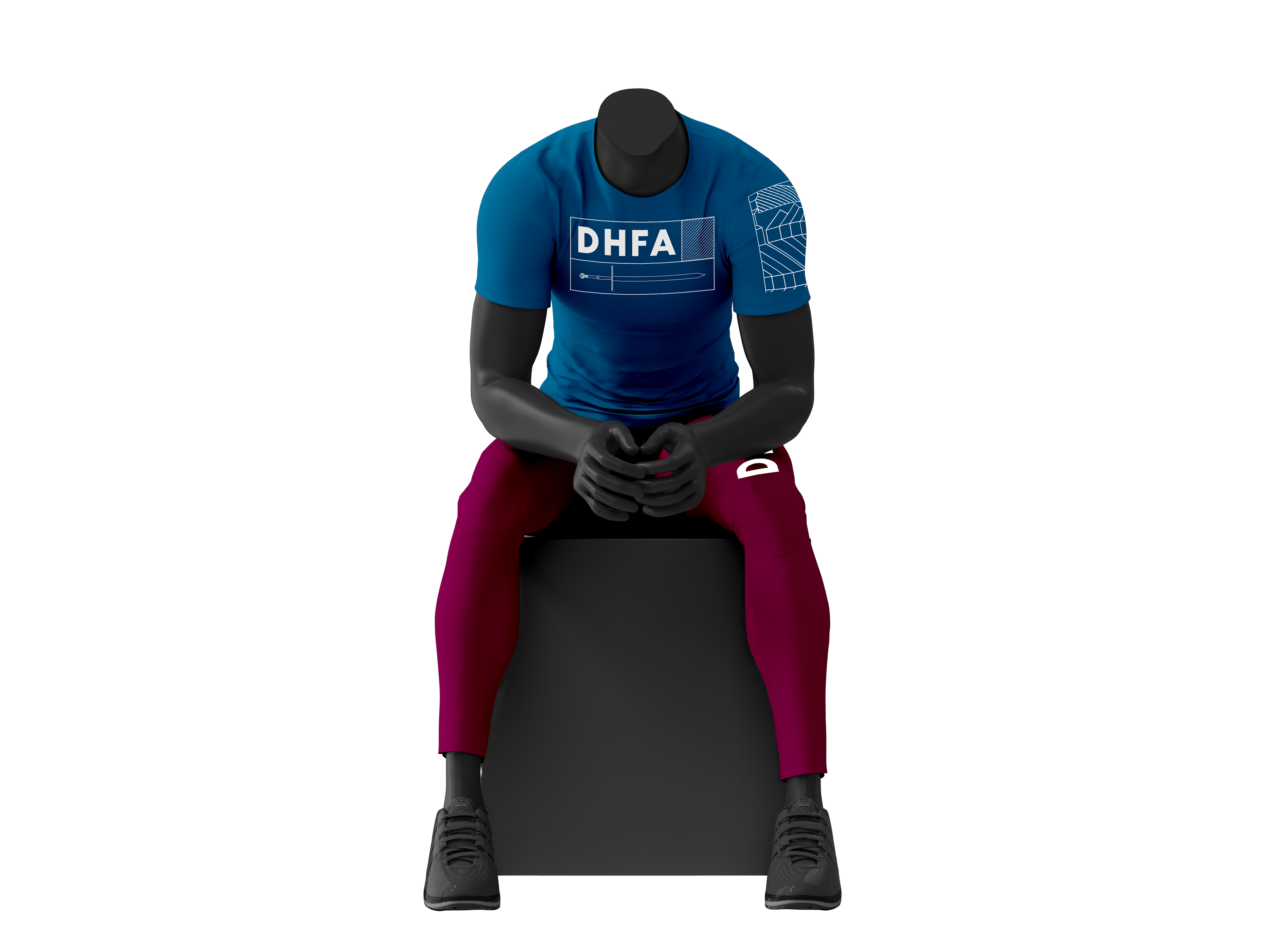
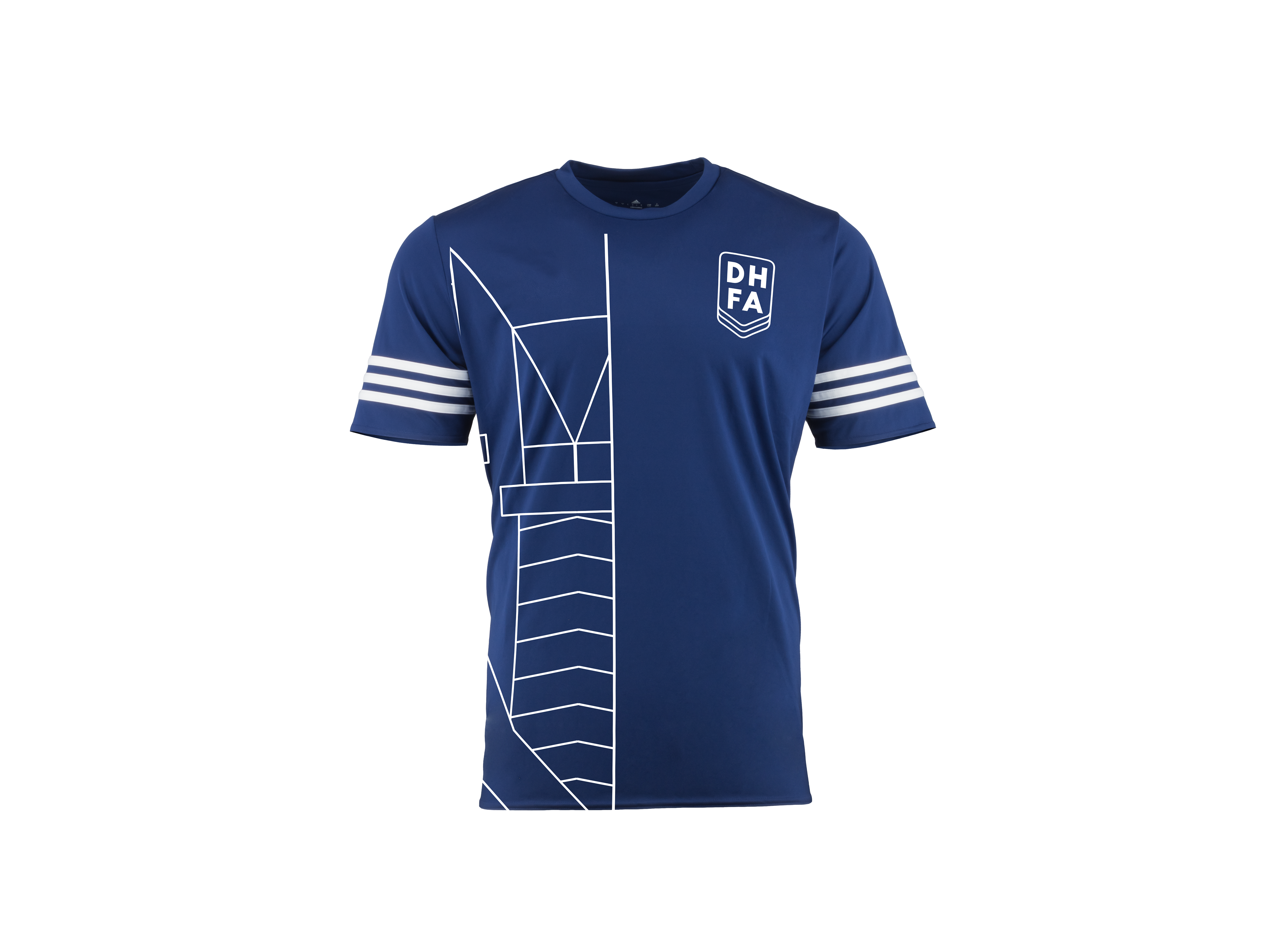
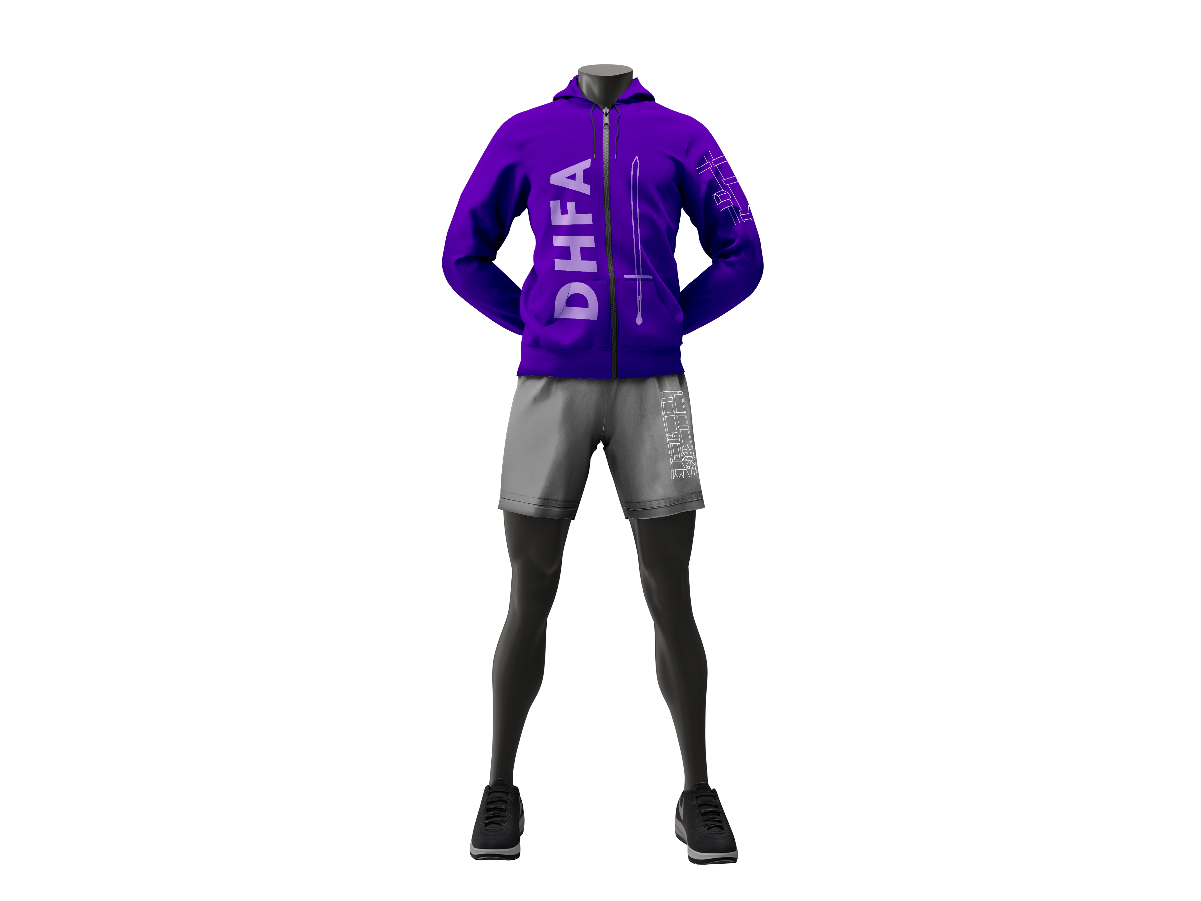
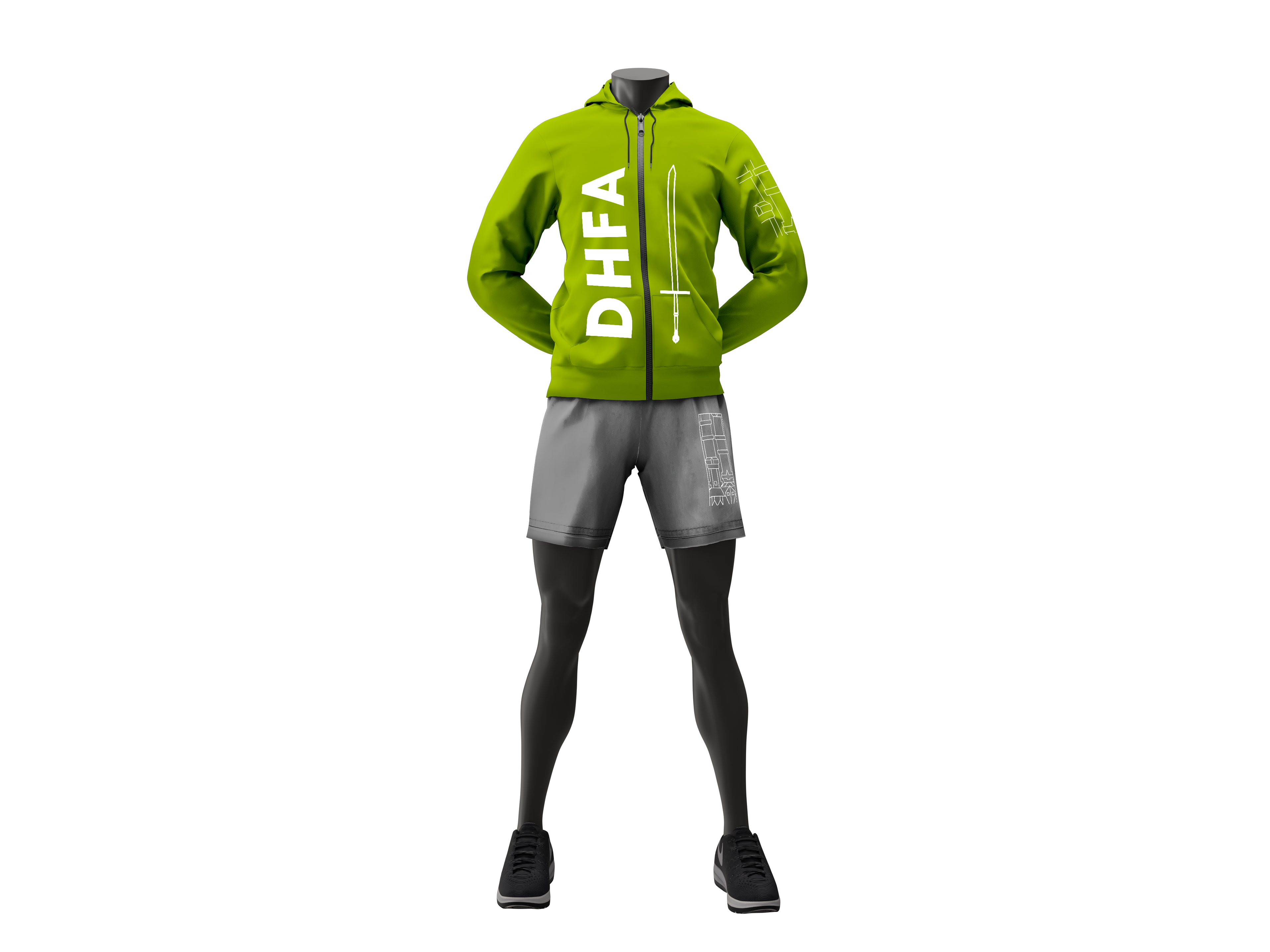
T-Shirt Line
This apparel was designed for the team and clients and was based on the tool kit designs. These T-shirts can be customized based on color and sword hilt.

